
Racking Color Matter in Warehouse?
- 05/03/2025
- Posted by: macgad-admin
- Category: Racking System
Warehouse Racking Color: The Ultimate Guide to Safety, Visibility, and Branding
Warehouse racking color plays a crucial role in warehouse operations. However, many overlook its significance. While factors like load capacity, layout, and durability are essential, choosing the right racking color enhances safety, efficiency, and branding. Therefore, understanding how to implement an effective color-coded system is vital. This guide explains why racking color matters, explores the best options, and provides practical tips for implementation.
Why Warehouse Racking Color Matters
Enhancing Safety and Compliance in Warehouse Racking
Warehouse racking color serves as a visual signal to highlight safety zones and potential hazards. Moreover, bright colors like yellow or orange help:
- Alert workers to high-risk areas.
- Improve visibility for forklift operators and pedestrians.
- Ensure compliance with industry safety guidelines.
Although no strict legal requirements exist for racking color, many warehouses adopt best practices. For instance, using yellow for caution and red for emergency areas helps reduce workplace accidents. Consequently, employees can quickly recognize dangerous zones, minimizing risks in busy warehouses with heavy foot and vehicle traffic.
Organizing and Increasing Efficiency with Warehouse Racking Color
In addition to improving safety, a well-organized warehouse streamlines operations and reduces errors. More specifically, a color-coded racking system helps:
- Workers quickly identify different storage zones.
- Reduce picking errors through clear visual markers.
- Simplify training by offering intuitive navigation cues.
For instance, assigning distinct colors to product categories enables employees to navigate efficiently without relying solely on labels. Furthermore, new workers adapt more quickly when they follow a clearly defined color-coded system. As a result, warehouse productivity improves significantly.
Strengthening Branding and Professionalism Through Warehouse Racking Color
A visually cohesive warehouse reflects organization and professionalism. In fact, a well-maintained, color-coordinated racking system:
- Enhances a company’s professional image.
- Reinforces brand identity through corporate colors.
- Creates a positive impression on visitors and clients.
When clients visit a warehouse, they associate a structured, color-coded environment with efficiency. Additionally, a visually appealing and organized space strengthens customer trust and sets a company apart from competitors. Because of this, investing in the right warehouse racking color system is essential.
Boosting Employee Morale and Productivity with Proper Warehouse Racking Color
The right racking color scheme positively influences employee morale and productivity. Research indicates that:
- Bright colors like yellow enhance alertness and energy.
- Cool tones like blue and green promote focus and calmness.
- A balanced mix of colors fosters a pleasant working environment.
A thoughtfully designed color scheme creates an engaging atmosphere, reducing stress and increasing worker satisfaction. Moreover, employees in visually appealing workspaces tend to stay more engaged and efficient. Consequently, productivity levels improve, leading to better overall warehouse performance.
Best Colors for Warehouse Racking
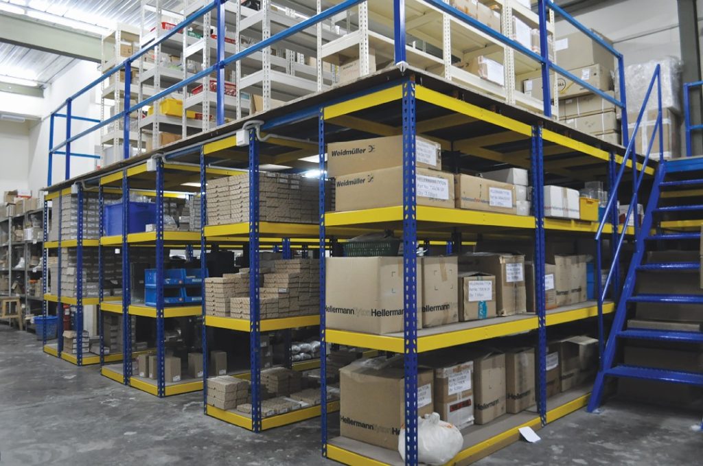
Yellow – High Visibility & Safety
- Increases safety by making hazards noticeable.
- Commonly marks caution zones.
- Helps forklift operators and workers identify pathways.
Yellow is widely recognized for safety, making it ideal for high-risk areas. Warehouses use it to mark aisles, step edges, and hazard zones. Furthermore, its high visibility ensures that workers can easily identify important areas, preventing unnecessary accidents.
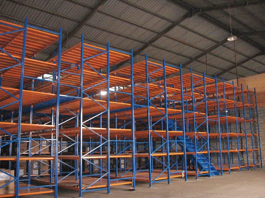
Blue – Professional and Calm
- Creates a clean and organized look.
- Promotes focus and reliability.
- Enhances the warehouse’s overall appearance.
Blue fosters professionalism and is commonly used in corporate branding. Additionally, its calming effect helps workers concentrate, making it ideal for inventory zones requiring accuracy. Because of this, many warehouses integrate blue into their racking systems.
Orange – Caution and Alertness
- Highlights high-traffic areas.
- Encourages awareness in busy zones.
- Balances visibility with a less aggressive look than red.
Warehouses frequently use orange in areas requiring extra caution, such as loading docks and intersections where machinery operates. Additionally, its bright yet less intense tone serves as an effective alternative to red. Therefore, using orange in busy areas enhances safety without overwhelming workers.
Green – Organization and Eco-Friendly Messaging
- Defines specific zones, such as eco-friendly storage areas.
- Creates a calming atmosphere and reduces stress.
- Improves inventory organization.
Green represents safety and sustainability. If a warehouse prioritizes environmental responsibility, incorporating green into racking systems reinforces this message. Moreover, it helps distinguish specific storage areas from high-traffic zones, ensuring better warehouse organization.
Red – Hazard Identification and Emergency Markings
- Clearly marks emergency or restricted areas.
- Identifies fire hazards or danger zones.
- Immediately draws attention to critical locations.
Red universally signals danger and emergency situations. It commonly marks fire exits, fire extinguisher locations, and restricted areas. Consequently, employees can quickly identify emergency zones, leading to faster response times during crises.
Gray or Black – Neutral and Modern Look
- Provides a sleek and professional appearance.
- Conceals dirt and scuff marks.
- Works well in low-traffic areas where high visibility is unnecessary.
Although dark colors create a modern aesthetic, excessive use can make a warehouse feel dim. Gray and black work best in areas that do not require high visibility. Additionally, they help maintain a clean appearance by concealing dirt and wear.
How to Implement an Effective Warehouse Racking Color System
Prioritize Safety
- Identify high-risk areas and assign appropriate colors.
- Use high-visibility shades like yellow and orange in busy zones.
Follow Industry Standards
- Research color-coding guidelines relevant to your industry.
- Implement commonly accepted colors to maintain uniformity.
Align with Brand Identity
- Integrate corporate colors into the warehouse design.
- Maintain a consistent color scheme across all warehouse locations.
Ensure a Systematic Color-Coding Approach
- Develop a structured plan for color usage.
- Maintain consistency to prevent confusion among employees.
Consider Psychological Impact
- Use bright colors in high-energy areas.
- Apply cool tones in sections requiring focus and precision.
Plan for Future Growth
- Select a color system that accommodates expansion.
- Maintain flexibility to adapt as operational needs evolve.
Conclusion: The Impact of Warehouse Racking Color
Warehouse racking color influences safety, organization, branding, and productivity. A well-planned color-coded racking system optimizes efficiency while creating a visually structured environment. Because of this, warehouse managers should carefully consider their color choices.
By selecting high-visibility colors for safety, using a systematic color-coding approach for organization, and integrating branding elements, warehouses can enhance functionality and professionalism. Since warehouse management continues to evolve with technology and sustainability trends, racking color will remain a crucial factor in operational success.
Looking to optimize your warehouse racking system? Contact us today for expert solutions!